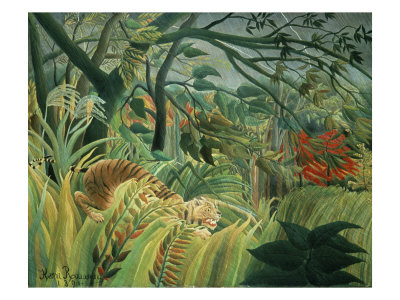
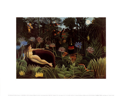
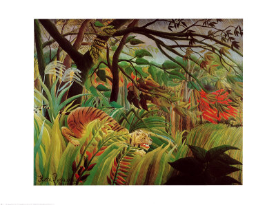
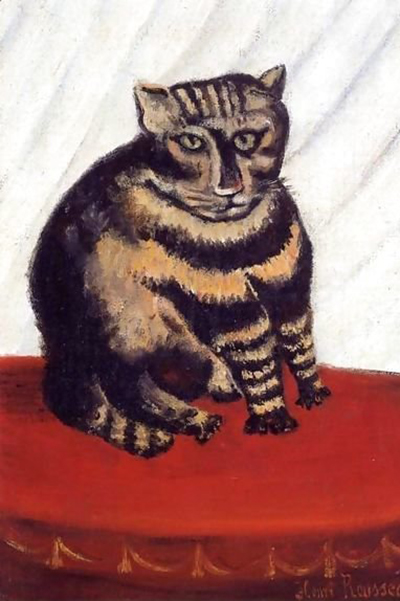
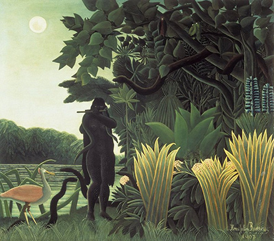
Many aspiring artists find themselves trapped in a paradox when attempting to mimic the style of Henri Rousseau, the King of Naive Art. Their finished naive portraits often inadvertently resemble hyper-realistic oil paintings, losing the essential spirit of the genre that celebrates the innocence and childlike wonder of perception. The challenge lies in understanding that true naivety is not merely about technical simplicity, but about a fundamental shift in how one observes and renders the human form. To create a genuine naive portrait, one must strip away the polished layers of academic training that emphasize perfect proportion, lighting, and texture. Instead, the goal is to capture the raw, unfiltered gaze of the subject, much like a child seeing the world for the first time, where lines are honest, colors are bold, and perspective can bend to the whims of emotion rather than geometry.
The Weight of Academic Training
The primary obstacle preventing artists from achieving a truly naive look is often the deep-seated knowledge acquired during formal art education. When an artist knows how to draw, they tend to draw correctly; they know exactly where the eyes should be, how the nose connects to the forehead, and how light falls on the cheekbones. This internal compass of "correctness" acts as a filter, smoothing out the jagged edges and irregularities that define the naive aesthetic. To break free from this mold, the artist must consciously suppress their knowledge of anatomy and perspective. They must learn to draw what they see, not what they know should be there. This requires a deliberate exercise in distortion, where the artist allows the composition to feel spontaneous and unpolished, embracing asymmetry and unexpected angles that reflect the subject's unique presence rather than a standardized ideal.
Mastering the Unpolished Line
The quality of the line is perhaps the most critical element in distinguishing a naive portrait from a realistic one. In academic art, lines are often refined, hidden within the shading, or smoothed over to create a seamless transition. In contrast, naive lines are often visible, textured, and expressive. They might be wavy, double-lined, or abruptly stopped, mimicking the way a child might trace a shape with a crayon or a quick brushstroke. This tactile quality brings a sense of immediacy and truth to the work. The artist should focus on making the brushwork or pencil strokes feel like a direct physical interaction with the paper, rather than a calculated application of paint. By allowing the line to fluctuate in weight and confidence, the portrait gains a life that feels alive and unscripted, capturing the essence of the subject without the need for photographic precision.
Simplifying the Complex Anatomy
While the line must be expressive, the underlying structure of the face must be simplified to avoid the trap of realism. Naive art does not ignore anatomy; it reduces it. Complex muscles, intricate bone structures, and subtle shadows are flattened into basic shapes. The face is often constructed from simple geometric forms—circles, ovals, and triangles—that are then decorated with features rather than built up layer by layer. This approach creates a stylized, almost iconographic representation that feels universal yet specific to the individual. The artist should practice drawing faces using only a few key planes, ignoring the nuances of aging, scar tissue, or specific bone protrusions that would make the portrait look like a photograph. Instead, focus on the character of the eyes and the expression of the mouth, allowing these features to carry the emotional weight of the piece.
Harnessing the Freedom of Color
Color in naive portraiture serves a dual purpose: it defines the form and it evokes the mood. Unlike realistic painting, where color is used to match the actual skin tone and environment, naive color is often chosen for its emotional impact or symbolic meaning. Artists may use flat areas of bold color, ignoring the gradual gradients found in nature. A face might have a blue nose or green cheeks, not because of reality, but to emphasize a feeling of vitality or warmth. The use of high contrast and saturated hues can make the portrait pop with an energy that realism often dampens. It is important to remember that in naive art, the color is part of the composition's rhythm. The artist should experiment with non-naturalistic palettes, using complementary colors to create vibrancy and ensuring that the background does not blend seamlessly into the skin but rather contrasts with it to make the figure stand out as a distinct, almost magical entity.
Embracing the Imperfect Composition
Finally, the composition of a naive portrait should feel organic and unforced. There is no need to center the subject perfectly in the frame or adhere to the rules of the rule of thirds with mathematical precision. The framing can be loose, cropping the face at odd angles or including elements of the background that intrude in a way that feels accidental yet intentional. This lack of rigid structure invites the viewer into the world of the artist's imagination, creating a sense of discovery rather than observation. By stepping back and allowing the composition to evolve naturally during the process, the artist can capture a fleeting moment of connection with the subject that a carefully planned photograph could never replicate. The result is a portrait that feels less like a depiction of a person and more like a memory or a dream, holding a profound and enduring truth that transcends mere visual accuracy.
To truly master this style, consider integrating the following steps into your workflow:
- Sketch the subject's outline using a light, shaky hand to introduce natural imperfection.
- Apply color in broad, flat strokes without blending gradients to maintain surface texture.
- Deliberately distort proportions if a specific feature, like a large nose, feels more expressive.
- Use a palette of highly saturated, non-naturalistic colors to create a dreamlike atmosphere.
- Leave some areas of the canvas partially uncovered to suggest depth without defining it.
- Avoid using a straight edge or ruler; embrace the wobble of the hand and the curve of the tool.
- Focus on the emotional expression rather than the exact physical resemblance to the sitter.