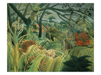
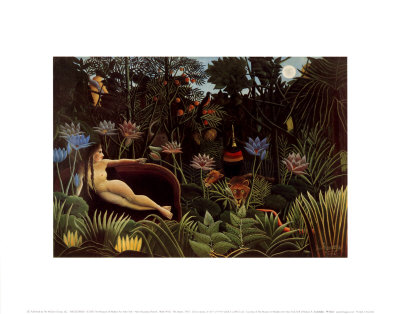
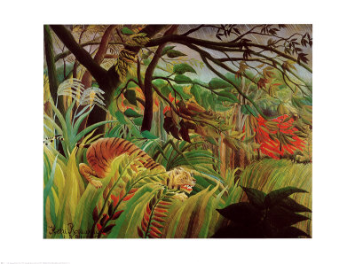
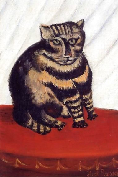
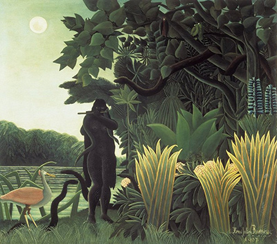
Henri Rousseau, the master of naive art, revolutionized the perception of the jungle not through photorealism, but through a vibrant, almost hallucinogenic use of color that felt entirely his own. His work teaches us that color is not merely a descriptor of reality but a language of emotion, energy, and pure imagination. By stepping away from the naturalistic limitations that bind many traditional painters, we can unlock a visual vocabulary that speaks directly to the viewer's subconscious, creating scenes that feel both wild and intimate.
The Psychology of Color Dissonance
To mix bold colors effectively, one must first understand that they do not need to harmonize in the way nature does. In the natural world, green and blue often blend seamlessly, but in a painting intended to evoke a dream state or a wild interior, these colors should clash intentionally. This dissonance creates tension and excitement, drawing the eye to specific focal points and preventing the canvas from appearing flat or passive. When you mix a vivid, almost electric blue with a saturated orange, you are not describing a sunset; you are describing the feeling of heat radiating against the coolness of the night air, a sensation that feels more immediate than a photograph could ever capture.
Techniques for Creating Synthetic Hues
The foundation of Rousseau's unique style lies in how pigments are combined on the palette before they ever touch the canvas. Traditional color theory suggests mixing colors to achieve neutrals, but bold artistic expression often requires the opposite approach. Start by selecting two highly saturated, complementary colors that are not found in nature, such as a deep, almost black-purple mixed with a bright, acidic yellow. By keeping the pigments separate until the moment of application, you retain their individual vibrancy, allowing them to bounce light off each other and create an optical illusion of new colors that do not exist in the physical world. This synthetic approach allows the artist to push the boundaries of perception, making the paint itself seem to glow from within the frame.
Mastering the Brushstroke and Glaze
Once the base colors are mixed, the application method becomes just as critical as the pigment selection. Rousseau often used broad, sweeping strokes that covered large areas of the canvas with a single, unified mass of color, yet within that mass, subtle variations created depth. To achieve this, consider using a wet-on-wet technique where the background is applied with a high-gloss glaze, allowing the underlying layers to shimmer through. This transparency adds a luminosity that flat, matte colors cannot achieve. Furthermore, do not fear leaving the brush in the paint; thick, impasto applications can create texture that catches the light, adding a three-dimensional quality to the two-dimensional surface. This tactile engagement invites the viewer to touch the image mentally, bridging the gap between the observer and the artwork.
Breaking the Rules of Light and Shadow
One of the most liberating aspects of bold color mixing is the ability to ignore the laws of physics regarding light and shadow. In a realistic painting, shadows are dark, cool, and recede into the background. However, in a bold, unconventional style, shadows can be painted with the same intensity as highlights, using deep reds, electric blues, or even neon greens. This reversal creates a surreal atmosphere where the distinction between light and dark is blurred, resulting in a scene that feels alive and constantly shifting. By treating shadow as a color in its own right, rather than merely the absence of light, you gain the power to manipulate the mood of the entire composition, turning a simple landscape into a mystical realm where the rules of the physical world are suspended.
Practical Strategies for Experimentation
Developing a personal palette requires patience and a willingness to experiment without fear of failure. Here are several practical steps to help you integrate these bold, unconventional colors into your practice:
- Create a master palette with a wide range of highly saturated primary and secondary colors, avoiding standard "artist's black" in favor of mixing deep grays from your own pigments to maintain purity.
- Mix your colors on small scraps of paper first to see how they interact under different lighting conditions before committing them to your main canvas.
- Try applying colors vertically or diagonally across the canvas to create dynamic movement that guides the viewer's eye through the composition.
- Limit the number of colors used in a single piece to ensure that no single hue dominates the entire image, allowing a few bold spots to pop against a restrained background.
- Observe natural phenomena like fire, auroras, or bioluminescence to find inspiration for color combinations that defy standard logic.
By adopting these strategies, you move beyond the imitation of nature and begin to construct your own internal reality. The goal is not to paint what is seen, but to paint what is felt. As you mix these bold, unconventional colors, remember that every stain on your palette is a step toward a new world, one where the impossible becomes possible and the unseen becomes clearly visible.