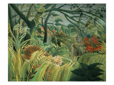
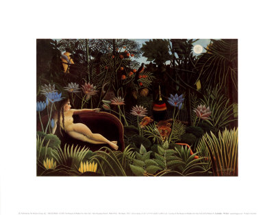
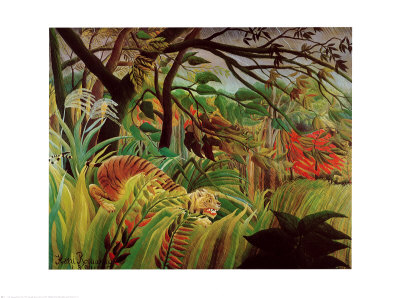
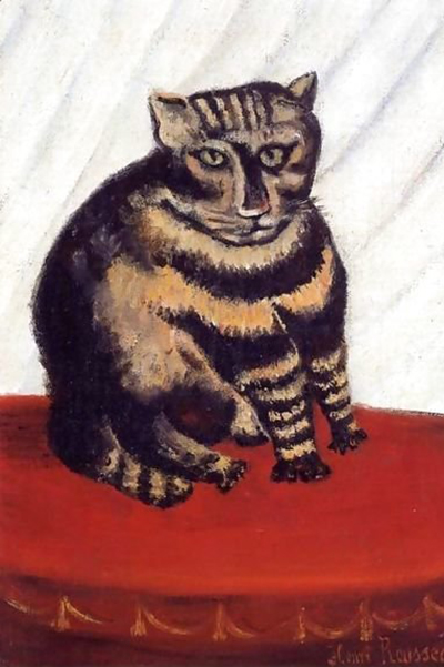
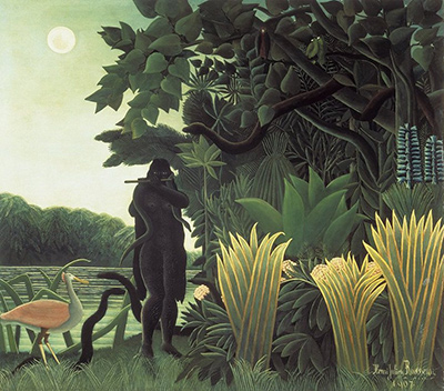
Watercolor is often misunderstood as a medium for restraint, yet its true power lies in the ability to burst with life and luminosity when handled with the right techniques. By understanding the physics of light, pigment saturation, and paper interaction, artists can transform soft washes into dynamic, fresh landscapes that seem to glow from within. This guide explores the essential strategies for achieving that signature Rousseau-like brilliance in your own watercolor work.
Mastering the Foundation of Color
The most common reason watercolors appear dull is an over-reliance on white paper to create highlights. While traditional methods encourage leaving patches of paper white, true vibrancy often comes from the richness of the pigment itself rather than the brightness of the substrate. Instead of relying solely on the paper's whiteness, consider using transparent white pigments like titanium or zinc white to deepen shadows and add texture. This approach allows the underlying colors to sing with more intensity, creating a depth that flat coloring simply cannot achieve.
The Science of Layering
Layering, or glazing, is the secret weapon of the watercolor master. When applied correctly, layers of color build up to create a luminous effect that mimics natural light. The key is to let each layer dry completely before applying the next, ensuring that the pigments sit optically on top of one another rather than mixing chemically within the paper. This optical mixing preserves the purity of the individual hues, allowing the final image to shimmer with a freshness that is difficult to replicate with opaque paints.
Techniques for Maximum Saturation
To ensure your watercolors pop, focus on these specific techniques:
- Use a small, stiff brush for applying the initial wash to control the water-to-pigment ratio precisely.
- Apply pigment in thin, even layers rather than thick patches to maintain transparency.
- Avoid over-wetting the paper, as excessive moisture can cause pigments to bleed and lose their distinct edges.
- Allow ample drying time between layers to prevent smudging and ensure clean optical mixing.
Managing the Paper Surface
The choice of paper plays a pivotal role in the final vibrancy of your work. Coarse papers with a heavy texture can interfere with smooth color transitions, leading to a mottled appearance that diminishes color intensity. Conversely, smooth, cold-pressed or hot-pressed papers allow for sharper lines and more vivid color saturation. When working with textured surfaces, it is crucial to adjust your water consistency to ensure the pigment penetrates the texture without sinking too deeply, which can mute the colors. Selecting the right paper is as important as choosing the right pigments.
Embracing Imperfection and Flow
Finally, do not be afraid to embrace the natural flow of water on the paper. While precision is valuable, the organic movement of water can create unexpected highlights and color shifts that add a sense of spontaneity and life to the piece. This method, reminiscent of the playful, dreamlike quality found in many naive art styles, can make your work feel more alive and less rigid. By trusting the process and not fighting the medium, you allow the colors to interact naturally, resulting in a piece that feels fresh, energetic, and full of unexpected vitality.