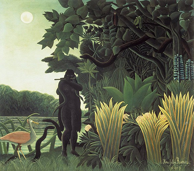
To paint stars that feel close enough to touch, one must abandon the rigid perspective of academic realism and embrace the raw, unfiltered vision of the naive artist. This approach invites the viewer into a space where the boundary between the canvas and the night sky dissolves, allowing the light to seem tangible and the darkness to press gently against the eye. By focusing on texture, color temperature, and the psychological weight of the void, we can create celestial bodies that do not merely sit on the surface but seem to hover just beyond our fingertips.
Mastering the Language of Light and Shadow
The foundation of any convincing starry scene lies in understanding how light behaves, yet in naive art, we often prioritize the emotional truth of the glow over the scientific accuracy of the ray. When painting stars that appear close, you must decide how much of the surrounding darkness is visible. In a realistic depiction, the sky fades to black at the edges, but for that intimate, tactile effect, you might keep the deep blues or purples closer to the center of your composition. This technique tricks the eye into feeling that the vastness of the universe is actually a cozy, enclosed room. The key is to avoid harsh contrasts that flatten the image; instead, use soft, blended transitions that suggest the air itself is vibrating with energy.
Choosing the Right Palette for Celestial Depth
The colors you select will define the atmosphere of your night scene. Traditional naive painters often rely on primary colors, but to achieve that feeling of proximity, you need a sophisticated understanding of complementary contrasts. Deep indigos mixed with touches of violet can create a rich, velvety backdrop that makes a single point of light pop with intensity. However, true intimacy often comes from the warmth of the glow itself. Imagine a star not as a white dot, but as a warm ember or a glowing yellow-orange orb that casts a faint, ghostly light on the nearby canvas. By warming the edges of your star against the cool, dark sky, you create a visual tension that suggests physical contact. The star feels like it is radiating heat, inviting the viewer to reach out, even if they cannot touch the paint.
The Art of the Imperfect Stroke
Perhaps the most crucial element in creating stars that feel close enough to touch is the quality of the brushwork itself. Smooth, blended gradients often lead to a polished, distant look, whereas the "naive" style thrives on visible, expressive strokes that retain their individual character. When applying the light of your star, do not over-blend the paint to a perfection that feels artificial. Leave some texture, some rough edges, and perhaps even a few stray dabs of white or silver that look like they were dropped by chance. This imperfection is what gives the star its humanity and its presence. Think of your brush as a tool for capturing a fleeting moment of wonder rather than a machine for creating a perfect image. The slight smudges and the direction of the brushstroke should mimic the way light scatters in our own eyes, creating a sense of movement and life.
Here are specific techniques to reinforce the tactile quality of your work:
- Apply thick, impasto strokes where the star is brightest to give it physical bulk.
- Use a dry brush to create a dusty, atmospheric veil around the edges.
- Mix a tiny amount of white with the star color to create a "flash" effect.
- Blend the background colors slowly to mimic the scattering of light in the eye.
- Vary the pressure of your brush to create uneven, organic shapes.
- Use a palette knife for the core of the star to add sharp, crystalline texture.
- Let the paint dry partially before blending to preserve surface ridges.
Guiding the Viewer's Gaze
Once your stars are painted, consider how they interact with the rest of the composition. If you are painting a group of stars, ensure that at least one feels significantly larger or brighter than the others, acting as a focal point that draws the eye forward. This larger star should be positioned where the viewer's natural line of sight is strongest, perhaps near the horizon or just above the center of the canvas. To enhance the feeling of proximity, you might add subtle "stars" or smudges of light on the bottom edge of the painting, suggesting that the sky is so close it feels like the ground beneath your feet. This plays with the psychological space of the viewer, making them feel smaller and more immersed in the cosmic event. It is a subtle manipulation that turns a simple painting into an immersive experience.
Final Touches and Atmosphere
In the final stages of your work, step back and look at the overall balance. Are the stars glowing too brightly? Do they seem to float too high in the air? To make them feel closer, you can add a layer of atmospheric haze or a soft, diffused light that washes over the entire scene, as if you are standing in the field watching the sky rather than looking at a picture of the sky. This layering adds depth and a sense of air between the viewer and the celestial objects. Remember, the goal is not to replicate the heavens, but to evoke the feeling of them. By combining bold, textured brushstrokes with a carefully chosen palette and a deep understanding of light, you can create a painting where the stars are no longer distant lights in a dark void, but warm, inviting points of light that beckon you to reach out and touch the night.