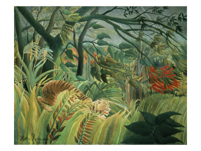
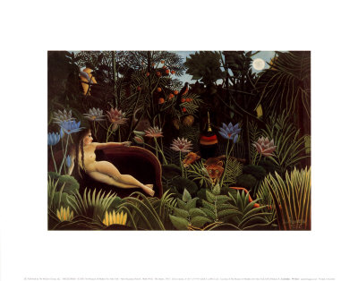
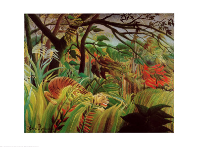
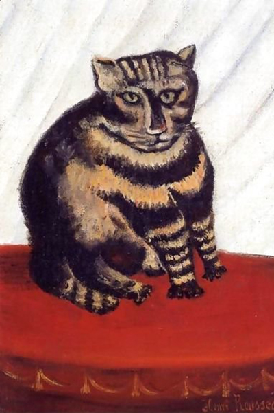
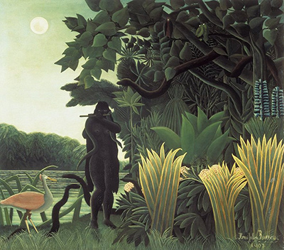
Capturing the illusion of closeness in a landscape is one of the most enchanting challenges for the naive artist, a discipline that demands an intuitive understanding of perspective rather than rigid academic rules. When we look at the works of masters like Henri Rousseau, we often notice how their mountains appear to loom right in front of the viewer, defying the vast distances usually associated with such geological formations. To achieve this effect, one must abandon traditional vanishing points and instead rely on bold contrasts, exaggerated scaling, and strategic use of color to manipulate the eye's perception of depth. This guide will walk you through the essential techniques required to make distant peaks feel immediate and tangible on the canvas.
Mastering the Scale of the Impossible
The first step in creating a mountain range that feels unnervingly close is to disregard the natural laws of diminishing size. In realistic art, a small mountain far away looks smaller than a large one nearby; in naive painting, the logic is often inverted or flattened. To make a distant peak appear closer, you must deliberately paint it with a similar or even larger scale than the foreground elements. Imagine the viewer stepping directly onto the hillside rather than looking up from a valley floor. This technique creates a surreal sense of immersion where the boundary between the earth and the sky dissolves.
- Identify your primary foreground element, such as a tree or a rocky outcrop.
- Measure the height of this element in your composition.
- Draw your main distant mountain peak with a height equal to or greater than this foreground object.
By forcing the eye to reconcile the large size of the far object with its distant placement, you create a cognitive dissonance that translates into a feeling of physical proximity. The viewer's brain struggles to process the scale, resulting in the illusion that the mountain is right there, waiting to be touched. This approach transforms the landscape from a distant vista into an intimate encounter, a hallmark of the naive style that prioritizes emotional impact over geographical accuracy.
The Power of Unblended Color
Color plays a crucial role in establishing depth, yet in naive art, it is often used to enhance the feeling of contact rather than recede into atmospheric haze. In traditional realism, distant objects are softened with cooler, grayer tones to simulate the effect of air and light scattering. To make a mountain look closer, you should apply the full, vibrant saturation of your palette to the distant forms. Instead of fading the blues and greens of a far-off range, use the same rich lapis lazuli or emerald tones found in the immediate foreground.
- Avoid using pale washes for distant mountains.
- Place the most saturated, intense colors on the farthest peaks.
- Use sharp, unshaded edges to connect the mountain directly to the sky or ground.
When the distant mountain retains the intense vibrancy of the near objects, it refuses to fade into the background. The lack of atmospheric perspective signals to the eye that there is nothing between the viewer and the rock face. This bold application of color creates a flat, two-dimensional surface that the brain interprets as a wall rather than a distance, effectively pushing the mountain forward into the viewer's personal space.
Manipulating Edges and Lines
The treatment of lines and edges is perhaps the most critical technical component for achieving the "closer than reality" effect. In academic drawing, outlines often soften or disappear in the distance to suggest depth. However, to make a mountain feel immediate, you must employ sharp, decisive, and sometimes jagged lines that cut across the canvas. These lines should not fade; they should remain as crisp and black as the ones defining the trees in the front yard.
Creating Visual Tension with Strong Contours
The goal here is to create visual tension that suggests the mountain is pressing against the picture plane.
- Draw the silhouette of the mountain with a single, unbroken black line.
- Ensure that this line intersects with other elements, like clouds or foliage, without breaking.
- Use thick, dark outlines to define the mountain's mass against the lighter sky.
When the outline remains sharp and unbroken regardless of how far the mountain is placed in the composition, it acts as a barrier that blocks the view beyond it. This technique reinforces the idea that the mountain is an object occupying the immediate space in front of the observer. The rigidity of the line suggests solidity and permanence, making the structure feel heavy and present, rather than a fleeting speck on the horizon.
Simplifying Complexity for Impact
Naive painting thrives on simplification, stripping away complex geological details to focus on the essential shapes and feelings of the scene. When a mountain looks closer, it often loses its intricate crags and valleys, presenting instead as a simplified, almost childlike form. This reduction in detail removes the visual noise that would otherwise suggest distance and complexity. The mountain becomes a distinct shape, a graphic element that commands attention much like a sign on a street, rather than a distant geological survey.
By reducing the mountain to a few bold strokes and avoiding excessive shading or texturing, you allow the form to stand out with clarity. This simplicity enhances the perception of closeness because the eye has less to traverse in terms of visual information. The mountain is presented not as a complex world unto itself, but as a direct, unmediated presence. This abstraction invites the viewer to engage with the form on a fundamental level, bridging the gap between the artist's hand and the viewer's eye. Ultimately, the mountain becomes a character in the painting, standing tall and proud in the very room where the canvas hangs.