Creating a painting where the subject commands immediate attention while the background supports rather than distracts requires a deliberate approach to composition and value control. When an artist struggles with backgrounds that fight for dominance, the solution often lies in understanding the psychological weight of color and value, ensuring that everything else recedes to let the hero of the piece breathe.
Mastering Value Hierarchies
The most effective way to prevent a background from competing with your subject is to establish a clear hierarchy of light and dark values. If your main subject is a bright, sunlit figure in the center, a background that is equally bright or darker than the subject will create visual noise, pulling the viewer's eye in the wrong direction. Instead, treat the background as a unifying mass of tone that supports the focal point. By keeping the background values generally lower than the brightest highlights of your subject, you naturally guide the eye inward. Conversely, if your subject is small and dark, a background that is too light might lose the subject entirely. The key is to ensure there is always a distinct separation in value between the foreground and the background, creating a sense of depth and separation on a flat surface.
Using Color Temperature to Recede
Color temperature is another powerful tool for managing visual competition. Warm colors like reds, oranges, and yellows tend to advance toward the viewer, making them appear closer, while cool colors like blues, greens, and purples tend to recede, making them appear further away. To keep your subject prominent, paint the area immediately surrounding it in a tone that is slightly cooler or darker than the subject itself. If your subject is a vibrant red rose, painting the leaves and stems in deep, shadowed greens and dark browns will push the background backward, allowing the red to pop forward. Avoid using colors that are too similar in both hue and value to your subject, as this creates a "flat" look where the eye struggles to find a resting place.
Simplifying Background Complexity
Often, the battle for attention is lost because the background is too busy. Naive art and traditional realism alike suffer when every inch of canvas is filled with intricate detail that rivals the complexity of the subject. Simplify the background by reducing the number of distinct shapes and textures. Instead of rendering every leaf on a distant tree, group them into a single, solid mass of color. Use broad strokes and limited detail to suggest the presence of the background without demanding the viewer's focus. Think of the background as a simplified stage set; it needs to imply a setting but should not require the audience to study the architecture. By limiting the number of focal points in the background to one or zero, you ensure that the only true focal point remains your subject.
The Art of Negative Space
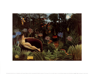
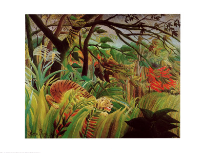
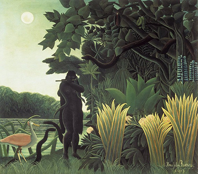
Negative space plays a crucial role in isolating your subject. This refers to the empty or less detailed areas around the object that define its shape. Intentionally leaving large areas of the background in a uniform tone or a single brushstroke can create a powerful frame around your subject. Do not be afraid to leave parts of the canvas unpainted or to use very light washes that blend softly into the edges of the subject. This technique, often seen in the work of Rousseau, creates a dreamlike quality where the background dissolves, forcing the eye to latch onto the crisp, defined lines of the main figure. By making the background "invisible" in terms of detail, you make the subject "visible" in terms of importance.
Establishing a Unified Palette
Finally, ensure that the entire painting relies on a unified palette, where the colors of the background are derived from the same family as the colors of the subject. If your subject uses a wide spectrum of colors, the background will likely compete with every single hue. Restrict your background to a narrower range of tones that complement the dominant colors in your subject. For example, if your painting is dominated by warm earth tones, keep the background to shades of ochre, burnt sienna, and soft greys. This cohesion ensures that the background feels like an extension of the subject rather than a separate, competing entity. When the colors work together in harmony, the distinction between the subject and the background becomes a matter of value and composition, not a clash of colors, resulting in a balanced and powerful image.
To achieve these results consistently, consider incorporating the following practical steps into your workflow:
- Sketch a rough value study before applying any final color to ensure the hierarchy is correct.
- Mix your background colors slightly darker than your subject's highlights to create immediate separation.
- Limit the number of distinct brushstroke directions in the background to avoid creating a chaotic texture.
- Observe how light falls on your subject and use those specific highlights to anchor the viewer's gaze.
- Step back from the canvas frequently to evaluate if the background is pushing the subject further forward.
- Test a small patch of color in the background against the subject to check for competing hues.
- Use a dry brush or lighter glaze to soften edges in the background if they feel too sharp and distracting.