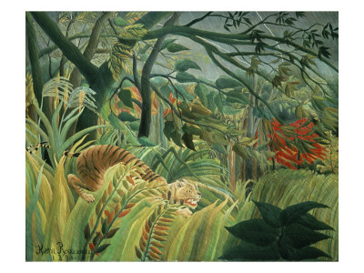
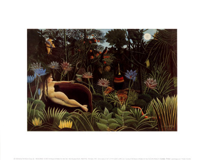
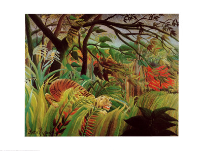
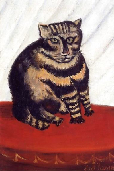
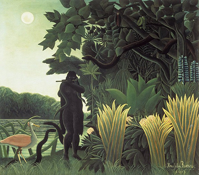
True naïve art does not merely mimic nature; it rebels against the polished veneer of conventional realism, stripping away the middleman of technique to reveal the raw, unrefined pulse of the human spirit. To capture this essence, one must learn to bypass the safe, muted harmonies of academic training and instead embrace a color language that feels electric, chaotic, and strangely honest. This approach invites the viewer to experience the world not as it is technically rendered, but as it is vividly felt in the moment of perception.
The Liberation from Imposter Syndrome
The primary barrier to achieving a raw aesthetic is often the internalized pressure to be technically perfect. In traditional art education, colors are taught in strict groups, mixed to create neutrals, and applied with precise control to mimic the texture of a leaf or the curve of a face. This discipline creates a barrier between the artist and the subject, smoothing over the jagged edges of reality. To achieve a naïve palette, one must first dismantle these rules, allowing the hand to move with a reckless freedom that ignores the need for logical color relationships. The goal is not to make the painting look real, but to make it feel true to the artist's immediate emotional state.
Harvesting the Vibrant Spectrum
When seeking unrefined tones, look to the very edges of the visible spectrum where natural light often fractures into intense bursts of color. Instead of the dull, earthy browns of a real tree bark, the naïve eye sees the sharp, electric orange of the sun hitting the wood. Realistic art tends to flatten these contrasts, while a raw approach demands that these intensities be preserved and even exaggerated. The colors should scream rather than whisper. Consider the way a wild flower in a forest might appear not as a soft pink, but as a blinding, almost painful magenta against the deep, saturated green of the surrounding foliage. This is not an error; it is a feature of the vision we aim to cultivate.
The Power of Staccato Contrast
Refined art relies heavily on harmony, blending colors so that they support one another without jarring the eye. In contrast, the raw aesthetic thrives on staccato contrast, where opposing hues clash deliberately to create visual tension and energy. A deep, matte blue might sit directly against a blazing, neon yellow, refusing to blend into a neutral gray in the process. This friction generates a sense of immediacy, as if the painting is happening in the viewer's eyes right now. The lack of transitional tones forces the eye to rest on specific points of high saturation, creating a rhythm that feels more like a heartbeat than a melody. This technique prevents the composition from ever feeling finished or settled, keeping the energy alive and restless.
Building a Palette of Raw Materials
To construct this visual language, one must curate a specific set of pigments that resist the tendency to mute under the brushstroke. The following list outlines the essential qualities you should seek in your materials:
- High Saturation: Avoid standard commercial paints that are pre-mixed with white or gray to ensure longevity. Seek out pigments that are 100% pure, often labeled as "full strength" or "prismatic," which offer the maximum intensity of hue without dilution.
- Unmixed Textures: Choose paints that hold their texture well, such as linseed oil-based oils or heavy body acrylics, allowing the brush to leave visible ridges and peaks of color that catch the light unevenly.
- Limited Neutral Tones: Minimize the use of blacks and grays. Instead, rely on the juxtaposition of bright colors to create depth, using shadows as dark blues or purples rather than true black, which can kill the vitality of the scene.
- Cold and Hot Extremes: Ensure your palette includes both the coldest possible tones (like electric ultramarine or icy cerulean) and the hottest (like cadmium red or chrome yellow) to allow for maximum vibrational contrast on the canvas.
The Psychology of the Uncouth Color
Finally, understanding the psychology behind these choices is crucial. Raw colors tap into a primal response in the viewer, bypassing the intellectual analysis of form to engage directly with emotion. A jagged, unblended stroke of crimson red can evoke a sense of urgency or danger, while a chaotic splash of chartreuse can suggest confusion or surprise. This unrefined quality mimics the way the human brain processes sudden stimuli in nature, where a flash of color demands attention before logic can catch up. By rejecting the polish of academic tradition, the artist aligns with a more direct, instinctual mode of seeing, resulting in work that feels less like a representation of the world and more like a direct transmission of feeling. The result is a visual experience that is gritty, immediate, and profoundly unrefined in the best possible way.