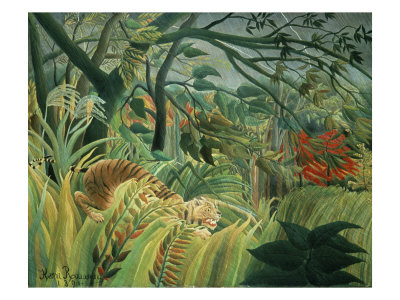
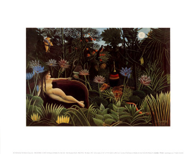
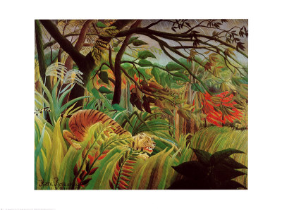
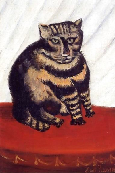
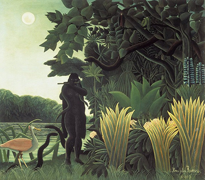
Henri Rousseau never sought to mimic the world with the hyper-realistic gradations found in classical academic painting; instead, he treated light and shadow as structural elements rather than optical illusions, creating a visual language where darkness and brightness define the shape and mood of his subjects without relying on smooth transitions. To achieve a similar effect in your own work, one must abandon the traditional goal of perfect blending and embrace the stark, almost photographic clarity that characterizes his most iconic works.
Breaking the Gradient Illusion
The primary challenge in naive art is resisting the urge to smooth out the edges between light and dark. In traditional realism, artists often use a technique called "chiaroscuro" with a focus on soft blending, but Rousseau's approach is fundamentally different. He understands that the human eye perceives form through the contrast between the brightest highlights and the deepest shadows, often ignoring the middle tones that connect them. When painting a tree or a figure, do not try to paint the entire spectrum of gray values in between; instead, paint the pure white of the sunlit leaves and the pitch black of the night sky, leaving the space in between undefined or abruptly cut off. This creates a sense of immediacy and distance that feels more like a memory or a dream than a direct observation.
Techniques for Sharp Value Separation
To execute this style effectively, you need a specific set of tools and mental habits. First, consider your color palette; limited and saturated colors often make the separation of light and dark easier to manage. You should also practice "value painting," which focuses solely on the grayscale of the image before adding any hue. Here are a few practical steps to maintain that sharp, non-gradient look:
- Avoid using a wide range of grays in your underpainting; stick to distinct black, mid-tone, and white values.
- Use a stiff brush or a palette knife to apply paint in distinct blocks rather than soft sweeps.
- Leave the canvas raw or textured in areas that should be shadowed to prevent the pigment from blending too smoothly.
- Paint the highlights with a bright, opaque white that sits on top of the darker layers without being scrubbed in.
By adhering to these techniques, you allow the viewer's eye to jump from one plane to another, creating a feeling of depth that comes from separation rather than perspective.
The Role of Texture in Defining Form
In Rousseau's paintings, texture is not merely a surface quality but an active participant in defining the relationship between light and shadow. He often left visible brushstrokes or applied thick impasto in areas where light hits, while flattening the brushwork in the shadows. This tactile difference helps the eye distinguish objects even without detailed shading. When you work on a canvas, try to make the physical application of the paint dictate the visual outcome. If a shadow is deep, you might apply a thin, dark layer of paint. If a highlight is bright, you might apply a thick, textured layer of white. This physical contrast reinforces the optical contrast, ensuring that the light and shadow do not blend into a muddy middle ground.
Composing with Negative Space
Rousseau frequently utilized negative space as a tool to frame his subjects and control the flow of light. By leaving large areas of white or dark background unoccupied by detailed objects, he forced the viewer's attention to the specific focal point while maintaining a sense of vast emptiness. In your own compositions, try to isolate your subject by surrounding it with areas of solid color or value. Do not fill every gap with mid-tones that would create a gradient. Instead, use the background itself as a source of light or shadow that interacts directly with the foreground. This creates a dynamic interplay where the light seems to emanate from the subject itself or be absorbed by the dark void around it, rather than being cast by an external, invisible sun.
The Emotional Impact of Flatness
Finally, remember that the lack of realistic gradients in this style is not a technical limitation but an intentional artistic choice that evokes a specific emotional response. The flatness creates a world that feels timeless, slightly surreal, and deeply intimate. It strips away the distracting details of the real world, leaving only the essential shapes and the power of light against dark. By committing to this style, you invite the viewer to look at the painting not as a window to a specific moment in time, but as a self-contained universe where light and shadow have their own intrinsic life. The result is a composition that feels both chaotic and controlled, a balance that only exists when you stop trying to mimic reality and start trying to convey its essence through pure contrast.
Related reading
- The Digital Brush: Reimagining the Dream World of Rousseau
- The Child in the Jungle: Cultivating the Spirit of Naïve Art
- Finding Your Own Wild Garden: A Guide to Choosing Subjects in Naïve Art
- The Artist's Canvas: Unveiling the Essentials of Naïve Creation
- Unlocking the Surreal Garden: A Guide to Finding Historical Naïve Art for Inspiration