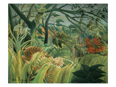
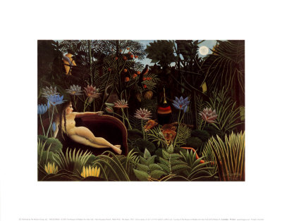
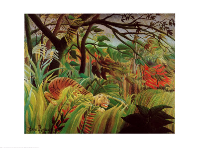
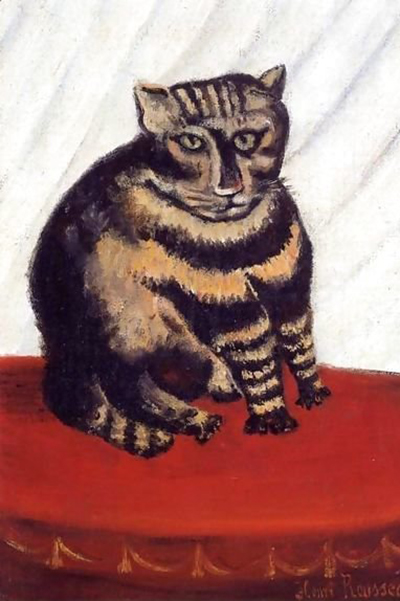
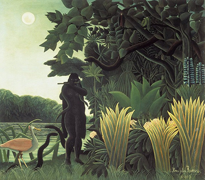
In the vibrant world of naïve ink drawings, the pursuit of dramatic contrast is a common aspiration, yet it often leads artists astray when they rely too heavily on black ink. While deep shadows are essential for grounding a composition, an excess of pure black can flatten the image, muting the delicate nuances of light and color that define the naive style. Mastering the balance between void and fullness is crucial for creating works that breathe and engage the viewer's eye.
Understanding the Essence of Naïve Style
The naive art style is fundamentally rooted in a specific visual philosophy that prioritizes innocence, directness, and a unique perspective on the world. Unlike academic art, which often seeks hyper-realism through complex shading techniques, naïve art embraces simplification and bold, unrefined strokes. The artist's goal is rarely to mimic the physical world perfectly but rather to express an emotional or intuitive truth. When an artist introduces excessive black ink in their naïve drawings, they risk importing the heaviness of traditional realism, which can suppress the playful and spontaneous energy that characterizes the genre. Instead of using black merely as a tool for shadow, it should be treated as an active element that serves the overall harmony of the piece rather than dominating it.
The Visual Weight of Pure Black
Black ink possesses a heavy visual density that can overwhelm softer tones and pastel washes often found in naïve illustrations. When a large area of the drawing is filled with solid black, the eye has little room to rest or explore the textures of the paper or the subtle gradations of other inks. This creates a visual barrier that separates the subject from its environment, making the drawing feel flat and two-dimensional. In a naïve context, where the joy lies in the simplification of forms, such an aggressive use of darkness can feel unintended and jarring. It is akin to shouting in a quiet room; the message is lost because the volume is too high. Artists must consider how black interacts with the white space, recognizing that negative space is often just as important as the ink itself in defining the shapes and moods of a drawing.
Techniques to Moderate Dark Areas
To achieve the desired contrast without sacrificing the lightness inherent to the style, there are several practical techniques an artist can employ to avoid drowning their work in darkness. Instead of relying on a single pot of black ink for all shadows, consider varying the pressure of your pen to create lighter grays that suggest depth without total occlusion.
- Utilize Layered Washes: Instead of applying solid black, try layering a thin wash of black over a lighter base to create depth while maintaining translucency.
- Incorporate Paper Grain: Allow the natural texture of the paper to show through dark areas, preventing them from looking like flat, painted patches.
- Balance with Color: Introduce touches of color within the shadow areas, such as deep blues or purples, to break up the monotony of pure black.
- Focus on Edges: Keep the edges of black shapes soft or broken rather than sharp, which helps integrate the dark areas more naturally into the composition.
By adopting these strategies, the artist can maintain the dramatic effect they seek while preserving the airy, open feel that is characteristic of true naïve expression. The aim is to create a dynamic interplay of light and dark where neither element dominates to the point of exclusion. This approach allows the viewer to perceive the subject clearly without being overwhelmed by the absence of light.
The Role of White Space in Composition
White space, or negative space, plays a pivotal role in the composition of naïve ink drawings. It is not merely empty background but an active participant in the artwork that defines the boundaries of objects and provides a resting place for the eye. When too much black ink is used, the white space is reduced to mere fragments, causing the composition to feel cramped and claustrophobic. A well-balanced naïve drawing relies on generous areas of white to allow the forms to float and breathe. This contrast is not about the darkness of the shadows but about the clarity of the forms against the void. By reserving significant portions of the page for white, the artist ensures that the drawing remains light, airy, and open to interpretation. The absence of ink becomes a crucial part of the narrative, guiding the viewer's gaze through the piece with minimal interference.
Practical Application in Your Next Drawing
When you sit down to create your next naïve ink drawing, take a moment to reassess your plan before dipping your pen into black. Ask yourself how much darkness is truly necessary to convey the shape and shadow of your subject. Often, what seems like a deep shadow in reality might simply require a suggestion of form or a change in tone. Remember that the beauty of naïve art often lies in its simplicity and its refusal to over-explain the scene through excessive detail or heavy shading. Embrace the possibility that your white space is doing the heavy lifting in telling the story. By stepping back and visualizing the final image with an eye toward balance rather than just contrast, you will likely find that your work achieves a more authentic and pleasing aesthetic. The journey of mastering this balance is an ongoing process of learning to trust the light as much as the dark.