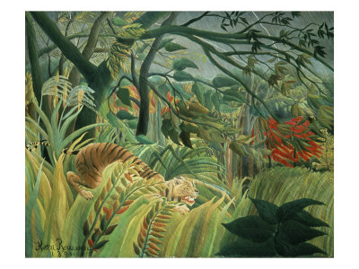
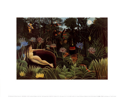
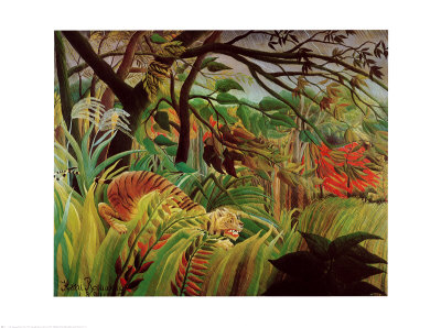
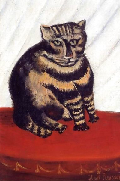
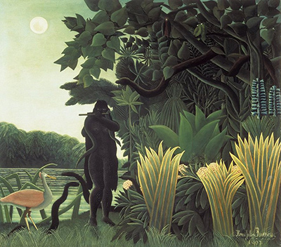
In the vibrant world of naïve art, where imagination reigns supreme and perception is shaped by the artist's unique lens, the use of color is not merely an aesthetic choice but a fundamental narrative device. When painters like Henri Rousseau or modern creators of folk art lean too heavily on a spectrum of grays, they risk drowning the essential light and life that defines the genre. A naive painting is meant to capture the spirit of a moment, often with a simplicity that belies a profound understanding of the world, yet an overabundance of mid-tones and shadows can create a muddy, flat effect that contradicts the very essence of naive observation. This article explores how the strategic use of gray can sometimes hinder the visual clarity and emotional impact of a naive composition.
The Nature of the Naïve Palette
To understand the mistake, one must first appreciate the typical palette of a naïve artist. These creators often operate with a simplified view of reality, where colors are intense, pure, and distinct. They do not necessarily mix colors perfectly; instead, they apply them with a boldness that suggests a direct connection to the subject. When a painter introduces too many shades of gray, they inadvertently shift the style toward academic realism or impressionism, genres that prioritize nuance over the raw, unfiltered joy found in naïve work. The gray becomes a tool for shading that suppresses the vibrancy of the primary colors, turning a lively scene into a somber, shadowed tableau.
Visual Weight and Clarity
One of the primary functions of color in a painting is to establish visual weight. In a naive composition, bright reds, electric blues, and sunny yellows naturally draw the viewer's eye to the focal point. When these areas are obscured by layers of gray, the painting loses its ability to guide the gaze effectively. The eye struggles to find a resting place because the tonal values are too similar across the canvas. Instead of a clear hierarchy where the most important elements pop against the background, the entire image becomes a uniform plane of light and dark without distinct separation. This lack of clarity is the first casualty of excessive graying, resulting in a composition that feels confused and undecipherable.
The Loss of Emotional Resonance
Naïve art is deeply emotional; it is often a cry of the soul, a celebration of childhood wonder, or a record of a rural life that feels timeless and untouched by industrial grays. The emotional resonance comes from the authenticity of the colors. When a painter overuses gray, the emotional temperature of the piece drops significantly. A sunny meadow becomes gloomy, a joyful dance becomes weary, and a blooming flower loses its vitality. The gray acts as a filter that dims the human experience being portrayed. The viewer senses that something is wrong with the mood, creating a psychological distance between the artwork and the observer that prevents them from fully connecting with the story being told.
The Technique of Value Contrast
To avoid this pitfall, the artist must understand the critical importance of value contrast. Value contrast refers to the difference between the lightest and darkest areas of the painting. In a successful naïve work, this difference is often stark and deliberate. The background might be a deep, solid blue or black, while the sky is a brilliant white, with the subjects sitting comfortably in between. If the artist spends too much time mixing intermediate grays, they lose the punch of the high contrast. It is not that gray cannot be used, but rather that it should be used sparingly and strategically to define forms rather than to create a general atmospheric haze. The gray should serve the shape, not replace the color.
Practical Steps for Value Management
For the artist looking to correct this common mistake or prevent it in future works, there are several practical adjustments that can be made. The key lies in simplifying the tonal structure before worrying about the hue. By reducing the number of distinct gray values, the painting regains its clarity and impact. Here are specific steps to take when dealing with a painting that has been over-graded in gray tones:
- Identify the focal point and ensure it is rendered in the brightest or most saturated color available, regardless of the surrounding shadows.
- Replace flat mid-tone grays with more vibrant, albeit slightly darker, hues to give the shadows more character and life.
- Introduce a single, dominant color for the shadows rather than relying on a mix of blacks, browns, and grays to create depth.
- Step back and observe the overall value range; if the difference between the lightest and darkest parts is less than 20%, the painting likely suffers from too much mid-tone gray.
- Consider using a lighter base or a more opaque medium to push the shadows forward, making them feel more active and less like a passive covering of the form.
The Danger of Academic Mimicry
Finally, there is the subtle danger of academic mimicry. When a naive artist attempts to replicate the techniques of a classical master by using complex layers of gray, they may end up pleasing themselves more than the viewer. The naive style thrives on its own distinct voice, a voice that is clear, direct, and unapologetically colorful. By drowning out the primary colors with a wash of gray, the artist sacrifices their unique voice in favor of a generic, muddy appearance. The result is a painting that looks like everyone else's painting rather than a specific, personal vision. True mastery in naïve art comes from knowing when to let the colors shine and when to hold back, ensuring that the gray remains a guest, not the host, of the composition.