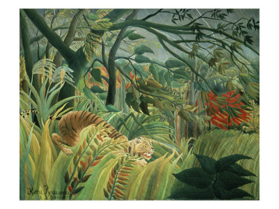
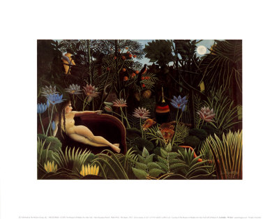
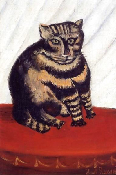
Selecting the appropriate paper texture is an often overlooked yet critical step in the creation of a naïve painting, serving as the silent partner to the artist's bold, simplified forms and vibrant colors. Just as a naive painter might exaggerate shapes and flatten perspectives, the choice of substrate must reflect this unique aesthetic by providing a surface that supports opacity, absorbs light, and enhances the tactile quality of the work without obscuring the intended visual impact. This guide aims to help artists navigate the vast landscape of paper grades to ensure their medium resonates perfectly with their naive style.
Understanding the Naïve Aesthetic Requirements
Naïve art is characterized by a lack of academic technique, often featuring vibrant, flat areas of color, strong outlines, and a sense of immediacy that feels almost raw or unrefined. When working with such a medium, the artist needs a surface that does not fight against these qualities. A smooth, cold, or highly textured surface can inadvertently alter the perception of the colors, making them look muddy or dulling the luminosity that is central to the genre. The goal is to find a balance where the paper acts as a neutral frame for the color, allowing the pigment to speak for itself while providing enough tooth to hold the brushstrokes firmly in place.
The Spectrum of Textures and Their Effects
Different papers offer distinct experiences for the hand and the eye, each influencing the final image in unique ways. For the naive artist, the texture chosen often dictates the method of application, whether it is a direct wash of color, a thick impasto application, or delicate washes. A cold-press surface, known as "medium" or "matt" finish, provides a gentle uniformity that allows for smooth blending while retaining enough surface irregularity to catch the bristles of a brush. This texture is generally the most versatile for naive works, offering a compromise between smoothness and grip. In contrast, a rough or heavy-coarse texture can create a rugged, almost primitive feel that mirrors the spontaneous energy of a naive sketch. However, if the artist intends to use fine lines or intricate details, a very rough surface might be too aggressive, causing the pigment to sink too deeply and lose definition. Conversely, a hot-press smooth surface, while excellent for precision, can sometimes result in a finish that feels too polished for the organic, emotional quality often sought in naïve expression.
The Psychology of Surface Finish
Beyond the physical properties of the paper, there is a psychological component to the texture that must be considered. The way light interacts with the surface finish can dramatically change the mood of the painting. A matte finish diffuses light, softening contrasts and creating a gentle, intimate atmosphere that often suits the dreamlike or folkloric qualities found in many naïve works. The absence of glare ensures that the viewer's focus remains on the composition and the emotion conveyed by the colors rather than being distracted by reflections. On the other hand, a high-gloss or satin finish can make colors appear more intense and vibrant, potentially lending a modern or commercial air to the piece that might clash with the traditional, rustic charm of the naïve style. Therefore, the artist must decide whether they want their work to feel grounded in reality or elevated through a more stylized presentation.
Practical Selection Strategies for Artists
When standing before a display of paper samples, it is easy to become overwhelmed by the variety of weights, textures, and prices available. To make a decision that serves the specific needs of a painting project, consider the following practical steps: First, examine the intended color palette and medium. If the work relies heavily on opaque watercolors or gouache, a paper with a closed, non-porous texture is preferable to prevent the colors from bleeding uncontrollably or becoming too transparent. If the artist plans to use a dry brush technique to create cracked, textured effects, a paper with pronounced grain will provide the necessary resistance. Second, test the paper by applying a small amount of the intended paint and allowing it to dry. Observe how the pigment sits on the surface and how the texture influences the final look. Third, consider the longevity of the piece. Higher-quality papers, often made from rag or cotton, offer better archival properties and are less likely to yellow or become brittle over time.
- Test the tooth: Rub a clean pencil on the surface; if it leaves a mark, the texture will hold paint well.
- Check the water absorption: A quick dip test can reveal if the paper will hold water well or become soggy too quickly.
- Assess the weight: Heavier papers (300gsm and above) are generally less prone to buckling when wet, which is crucial for large naive panels.
Final Thoughts on Material Harmony
Ultimately, the choice of paper is not merely a logistical decision but an artistic one that shapes the narrative of the naïve painting. There is no single "correct" texture for every style, as the best surface is the one that best supports the artist's vision and technical approach. By carefully evaluating the texture, finish, and weight of the available options, an artist can ensure that the medium enhances rather than hinders the expressive power of their work. Remember that the paper is the first element the viewer encounters, setting the tone for the entire experience of the painting.