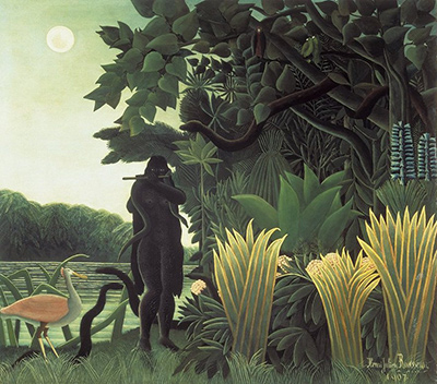
Capturing the essence of a specific theme within the realm of naïve art requires a disciplined approach to color, mirroring the intuitive yet structured vision of Henri Rousseau. By meticulously selecting hues that resonate with the subject matter, artists can transform simple sketches into vibrant narratives that feel alive with an otherworldly energy. This guide outlines a practical method for curating a color palette that honors the spontaneous magic inherent in naïve expression while ensuring visual coherence.
Defining the Emotional Core of Your Subject
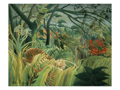
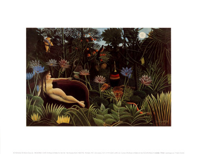
Before touching a brush or mixing a single tint, the artist must identify the emotional truth they wish to convey. Is the scene meant to feel like a bustling, sun-drenched market in the Congo, a mysterious jungle at twilight, or a quiet, pastoral morning? The mood dictates the temperature of the palette. A jungle scene might demand deep, saturated greens mixed with sharp, contrasting oranges and violets to create tension and depth. Conversely, a dreamlike landscape may benefit from soft, luminous pastels and a limited range of blues and lavenders. Establishing this core emotion ensures that every subsequent color choice serves a narrative purpose rather than acting as a random collection of pigments.
Selecting the Dominant Hues and Supporting Colors
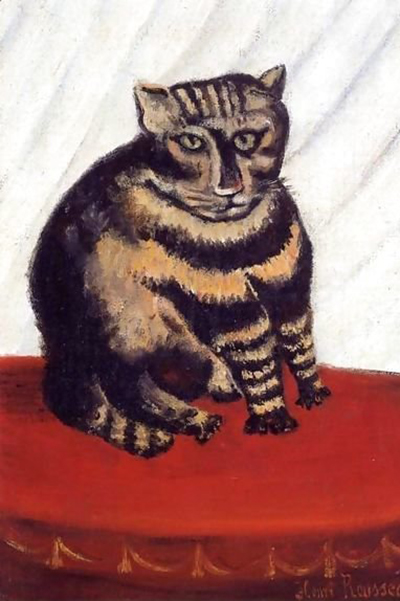
Once the mood is defined, the next step is to identify the dominant colors that will anchor the composition. In naïve art, flat areas of color are often used to define forms, making the choice of these primary hues critical. For a theme involving animals, one might select a vibrant ochre for the earth and a bright cobalt for the water. These dominant colors should be chosen from a simplified spectrum, avoiding overly subtle tones that might lose impact against the bold background. Surrounding these dominants are the supporting colors, which add texture and detail without overwhelming the main subject. These supporting hues can be lighter or darker variations of the dominant colors, or they can be complementary pairs used sparingly to create focal points. The key is to maintain a balance where no single accent color steals the show from the primary theme.
Testing Color Harmony Against Light and Shadow
A common pitfall in naïve painting is ignoring the interplay between light and shadow, often resulting in a flat appearance despite rich colors. To avoid this, every hue on the palette must be tested against both a highlight and a shadow. Even in a style that uses flat planes, the darkest shadow often possesses a different color than the darkest value; it might lean slightly toward a purple or a deep blue rather than pure black. Similarly, the brightest highlights should be pure white or a very light, almost transparent version of the dominant color. By preparing a swatch of each color in both light and dark values, the artist can ensure that the palette has enough range to create depth. This practice prevents the painting from looking muddy or two-dimensional, adding the necessary atmospheric perspective that makes the scene feel real and immersive.
Curating Physical Pigments for the Workspace
With the theoretical palette established, the practical task of gathering materials begins. The artist needs to source pigments that allow for high saturation and easy mixing. Acrylics, gouache, and watercolor are excellent choices for naïve art due to their vibrant qualities and transparency. A small set of primary colors—red, blue, and yellow—is essential, along with a few secondary colors like green and orange. It is also wise to include a neutral gray or a muted brown to ground the composition, preventing the image from becoming too "cartoonish" and allowing for subtle transitions. The physical arrangement of these paints on the palette should be organized logically, grouping analogous colors together to speed up the mixing process during the creative flow.
Finalizing the List for Execution
To streamline the creation process, compile the selected hues into a definitive list before starting the canvas. This checklist ensures that no crucial tone is forgotten during the frantic energy of creation.
- Identify the three dominant colors that will cover 60% of the canvas.
- Select two complementary accent colors to draw the eye to specific focal points.
- Gather three shades for shadows: a dark version of each dominant color plus a neutral dark.
- Secure three shades for highlights: pure white and two very light versions of the dominant colors.
- Ensure all selected pigments are fresh and properly mixed to guarantee consistent vibrancy.
By following this structured approach, the artist transforms a vague idea into a rich, colorful vision. The discipline of pre-planning the color palette allows the hand to move with freedom, unburdened by the worry of running out of the right tone at the last moment. This method captures the spirit of Henri Rousseau, blending the structured logic of composition with the boundless imagination of the naive style.