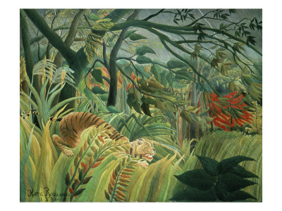
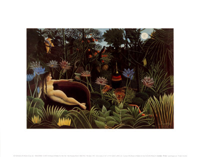
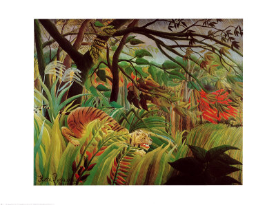
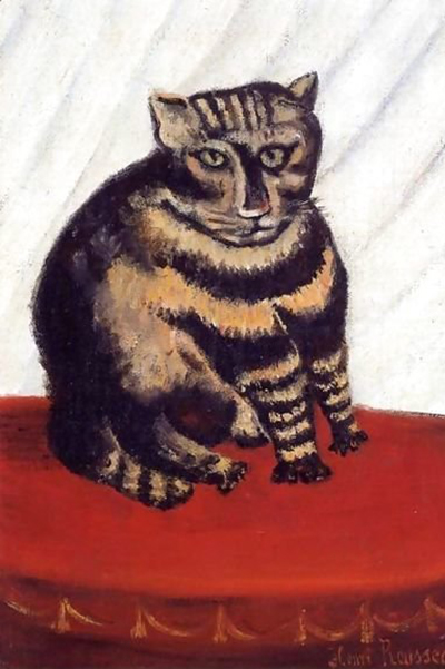
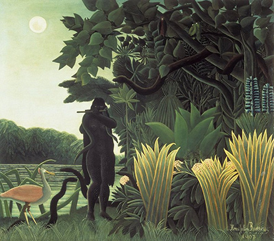
In the realm of printmaking and naive art, the choice of background color is often an underappreciated yet powerful tool for directing the viewer's eye. Just as Henri Rousseau utilized stark white spaces to isolate his exotic forests and jungle creatures, artists today can harness light-colored backgrounds to create striking visual contrasts. By selecting a pale hue, one effectively lowers the "noise" of the canvas, allowing the darker tones of the subject to emerge with crystalline clarity and depth. This technique does not merely serve an aesthetic purpose; it fundamentally alters how light interacts with the composition, creating a sense of space that feels both intimate and expansive.
Establishing a Foundation of Transparency
The primary advantage of using a light-colored ground, such as cream, off-white, or a very pale gray, lies in its ability to suggest depth without introducing competing visual elements. When a background is too dark or saturated, it begins to fight against the subject, creating a flat, muddy appearance where boundaries between foreground and background become indistinct. Conversely, a luminous background acts as a screen, allowing the lightest parts of the subject to appear as if they are glowing from within. This is particularly effective in prints where the ink density varies, as the light paper serves as a natural highlighter, enhancing the three-dimensional quality of the work. The key is to ensure the background tone is consistent and does not distract from the primary focal point of the image.
Manipulating Contrast for Maximum Impact
Contrast is the engine of visual interest, and light backgrounds provide a perfect canvas for manipulating it. In monochromatic or limited-color prints, the difference between the deepest black ink and the lightest paper can be dramatic, creating a graphic quality that is both modern and timeless. When working with color prints, the light background allows specific hues to pop, making reds appear warmer, blues seem deeper, and greens look more vibrant. Artists should consider the value range of their subject; if the subject contains a wide spectrum of shadows and highlights, a neutral light background will preserve these nuances. However, if the subject is already very light, the artist must carefully balance the background tone to ensure the subject remains legible and distinct. A subtle shift from pure white to a warm beige can significantly alter the mood, making the image feel softer and more organic.
Strategic Placement of Negative Space
Negative space is not merely empty area; it is an active element in the composition that defines the shape of the subject. By utilizing a light-colored background, an artist can strategically place negative space to guide the viewer's eye to the most important parts of the image. In the style of Rousseau, large swathes of pale background often frame the central subject, creating a sense of isolation that emphasizes its importance. Whether the subject is a solitary tree, a cluster of flowers, or a bustling scene, the light background provides a clean edge that prevents the eye from wandering aimlessly. It is crucial to consider the edges of the print as well; a light background can soften the transition between the ink and the paper, making the image feel less rigid and more fluid.
Practical Techniques for Application
Implementing a light-colored background requires attention to detail during the printing process, especially when dealing with complex compositions. For intaglio or lithography, the choice of paper is critical, as heavy, textured papers with a natural creamy tone often yield the best results for this style. For screen printing or watercolor washes, the technique of layering can be employed to build up a subtle, uniform light layer before applying the main subject colors.
- Select the Right Paper: Always choose paper with a natural, unbleached tone rather than stark, optical white, which can look harsh in prints.
- Control the Ink: When printing, ensure that light areas are printed with a very fine line or a minimal amount of ink to avoid muddying the background.
- Layering: If using wash techniques, apply multiple thin layers to achieve a smooth, even light ground without creating visible brushstrokes.
Enhancing Depth Through Texture
Finally, the texture of the paper itself plays a significant role in how a light background interacts with light. A slightly textured surface, such as cold-press or hot-press paper, can catch the light differently than a smooth surface, adding a tactile dimension to the light areas. This interplay between the physical texture of the paper and the visual lightness of the background can create a rich, multi-layered effect. By combining a light ground with varied ink textures, artists can create a sense of atmosphere that feels both realistic and dreamlike. The result is a composition that invites the viewer to linger, exploring the subtle gradations of light and shadow that define the subject against the luminous backdrop.