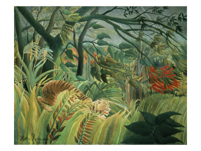
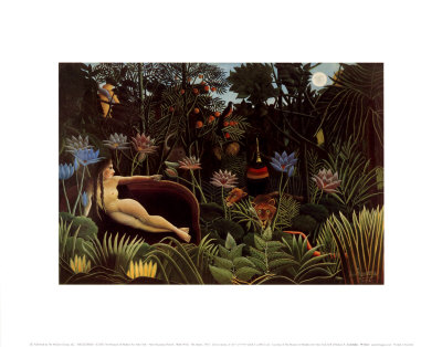
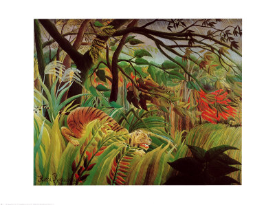
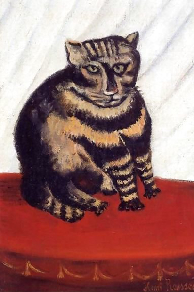
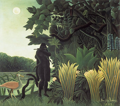
Navigating the colorful world of naive art requires a shift in perspective, moving away from strict academic rules to embrace the raw, emotional power of pigment. For beginners, understanding how these artists manipulate hue and value can transform a simple observation into a profound appreciation of their unique vision. This guide will walk you through the essential principles that define the distinctive chromatic language found in works like those of Henri Rousseau and other masters of the naive tradition.
The Liberation from Realism
Traditional art education often instills a rigid belief in optical realism, teaching students to mix colors on a palette to mimic the exact light reflected off an object. Naive artists, however, reject this constraint. They do not paint what they see with their eyes; they paint what they feel. A naive painter might choose a deep, bruised purple for a sunset not because that is the scientific color of the sky at that hour, but because that purple represents the heaviness of the evening or the memory of a childhood fire. This freedom allows the artist to bypass the brain's filtering mechanisms and access a more primal, intuitive understanding of color. In the realm of naive prints and paintings, color becomes an extension of the artist's inner life rather than a window to the external world.
Primary Colors as Building Blocks
While advanced naive artists may use a wide spectrum, the foundation of their work often rests heavily on the three primary colors: red, blue, and yellow. These are the most potent tools in their arsenal because they cannot be mixed further and provide the strongest vibrancy. When a naive artist applies red, blue, and yellow directly from the tube or pan, the result is often strikingly pure and intense, lacking the greyish undertones that naturally develop when pigments are overworked. This purity creates a flat, two-dimensional quality that is characteristic of the style. The colors sit side-by-side without extensive blending, creating a visual texture that feels solid and immediate, much like a block of colored glass.
Mixing for Emotional Impact
Once the primary colors are established, the naive artist begins to explore secondary colors like green, orange, and violet, but with a different intent than a realist. The mixing process is less about accuracy and more about emotional resonance. An artist might mix a burnt orange and a dark green to create a muddy brown, using it not to depict soil, but to suggest the warmth of a hearth or the decay of autumn. Subtle shifts in hue can drastically alter the mood of a piece; a single change from a cool blue to a warm violet can transform a scene from melancholic to nostalgic. This manipulation requires the artist to understand that color has weight and temperature, capable of pushing the viewer back or pulling them forward in the composition.
The Role of High Contrast
A defining feature of naive art is the frequent use of high contrast, where bright, saturated colors are placed directly against their opposites on the color wheel. This technique creates a dynamic tension that draws the eye immediately to the focal points of the image. By avoiding subtle gradations in the shadows, naive artists ensure that every part of the composition remains visible and lively. This approach can sometimes appear jarring to the trained eye accustomed to atmospheric perspective, but it effectively captures the flat, unadulterated joy of the naive style. The juxtaposition of stark white highlights against deep, saturated backgrounds gives the images a glowing, almost ethereal quality that persists long after viewing.
Practical Application for Observers
For the viewer and the aspiring artist, understanding these principles offers a way to engage more deeply with the subject matter. When looking at a naive print, ask yourself not "Is this color accurate?" but "What is this color trying to say?" Notice how the flat application of paint creates a sense of solidity and how the lack of blending forces the eye to take in the whole image at once. Whether you are studying historical works or experimenting in your own studio, remembering that color is an emotional language rather than a technical record will unlock a new level of appreciation. Embrace the imperfections and the boldness of the palette, for it is in the lack of pretense that the true soul of naive art resides.
To truly internalize these concepts, consider applying the following specific steps during your next viewing session:
- Identify the dominant primary colors used in the central composition.
- Observe where the artist has placed the brightest highlights against the darkest backgrounds.
- Notice how specific colors are repeated throughout the piece to unify the design.
- Imagine the story the specific hue of a single object is telling the viewer.
- Compare the flat layers of paint to the smooth gradients found in traditional academic art.